Developing Gradient Sets - Part 1

I've been spending some time this spring working on developing new gradient sets in our Crescendo yarn for a couple of different projects, and I thought it would be fun (and hopefully interesting!) to document the process here.
The sets that I created last year when we first launched this yarn more or less fall into two different categories. There are some where the change from skein to skein is a shift in the intensity of one colour, from pale to deep, such as this Pretty in Pink set.

Dyers refer to this intensity as "Depth of Shade" and it's usually calculated as a percentage of dry dye powder to the amount of fibre dyed, measured by weight. So, for this type of gradient my development technique is to create the base dye mix for the deepest colour, and then dilute it carefully to acheive the paler shades, aiming to have as smooth a transition as possible between each skein.
The second category that I often work with is sets where the change from skein to skein is in the hue rather than the intensity of colour, such as this Gaia set which shifts from blue to brown.

These tend to be a bit more complex to create, as some dye colours are stronger than others, so getting the right dye proportions can be trickier. I start with two different base dye colours (in this case blue and brown), and then vary the percentage of each used in each skein. You may notice that the intensity of the colour (the depth of shade) is actually almost exactly the same for each of the skeins in this set. The amount of dye used is consistent, I've just changed the proportions of the two colours.
During the development process I tend to make very scribbly notes in my dyeing notebook, trying to keep track of any adjustments to my plans that I make as I see what the dye actually looks like on the yarn. I find it's helpful to start out by making a theoretical plan according to what I think will work, but it always needs tweaking as I go to get exactly the right shades and proportions.

Then, once my tweaking is done, I translate all those scribbly notes into a recipe! I try to keep things as clear and consistent as possible so that our recipes can be followed by anyone in the studio with consistent results.

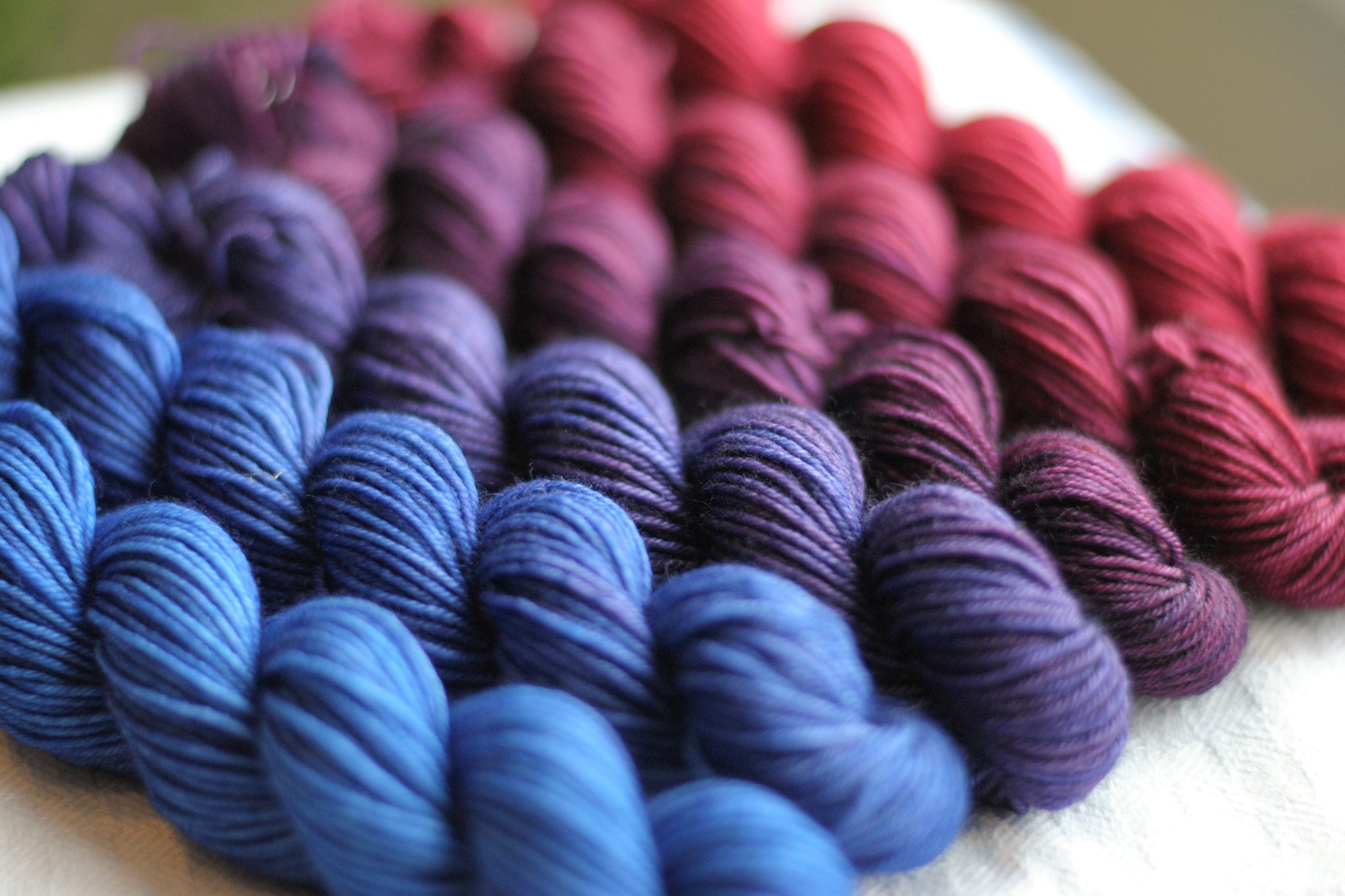
One of my gradient projects this spring has been to develop a new Crescendo set to bring with us to the Toronto Knitter's Frolic. I knew that I wanted to do one of the second type of gradient, and that I wanted to work with reds and blues. I was inspired by these tests that I did as part of a Dyer's Notebook workshop last year, showing the range of colours created by mixing sapphire and crimson in different proportions.

So I scribbled some new notes into my trusty notebook...

Mixed up my dyes...

And voila!

Because I was working with two dye colours that I use very frequently I was able to predict how they would behave enough that this recipe needed only a little bit of nudging as I worked.
UPDATE: This was originally a limited-edition colourway, which we dyed exclusively for the 2018 Toronto Knitter's Frolic. BUT, we recently had some renewed interest in it, and as of March 2021 we've added it into our regular line-up! We've called this colourway "True Love" and if you've fallen for it too you can purchase your set here.

3 Réponses
DONNA CORNAX
Yahoo!
Debbie
Hi Donna,
Thanks for taking the time to comment, I’m glad you found the post informative! I’ve always meant to write up a “part two” about dyeing more complex gradients, but haven’t taken the time to do it yet… Someday it will happen!
But also, some good news – you’ve inspired me to pull out my old notebooks and re-create this recipe. It’s a very pretty one, and I think it’s been a “Frolic Exclusive” for long enough now that it can be safely added to our current selection! Now I just need to come up with a name for it… Once that happens I’ll get it up on the website, most likely later this week.
DONNA CORNAX
I’ve been looking at the gradient sets for a while now – trying to decide which to use for the Ambah O’Brien "Radvent Pillow’ pillow. Saw your mention of the blog post on developing the sets and decided to read it. Informative for sure – and then I saw your Frolic special. I loved it – wanted and then I realized it was a one time only thing and the post was from 2018. Nevermind, I’ll decide on one of the other beautiful sets – but if you ever decide to dye this set again, sign me up to buy some!!!!!!
Laisser un commentaire
Voir l'article entier

Meet the Designer: Nidhi Kansal of knidhiknits


Debbie Sullivan
Auteur